Live Widgets

Live Widgets

The /IOTCONNECT™ Live Widgets provide real-time device telemetry visualization. Each widget connects directly to device data streams via SignalR and updates automatically as new telemetry arrives — no page refresh required. This page documents every live widget type with configuration details, supported data types, and use cases.

Common Configuration

All live widgets share these configurable properties:

Property Description
Title Custom display name for the widget header
Background Color Widget background (any hex color)
Font Color Title and label text color
Font Family Typography: Proxima Nova, Arvo, or system fonts
Font Size Title font size in pixels (default: 18)
Device Select the source device by Unique ID
Attributes Select one or more telemetry attributes from the device template
Resize / Move Drag edges to resize, drag title bar to reposition on grid

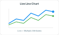
Live Line Chart

Live Line Chart Widget

Real-time streaming line chart that continuously plots telemetry values as they arrive. The chart scrolls horizontally showing a rolling time window of recent data points.

Configuration:

Setting Description Default
Device Select source device Required
Attribute Single numeric attribute to plot Required
Recent Data Points Number of historical points to display on load 10
Data Type INTEGER, DECIMAL Auto-detected

Behavior:

Chart auto-scrolls as new data arrives via SignalR

Shows timestamp on X-axis, value on Y-axis

Y-axis auto-scales based on incoming data range

Single attribute only (use Combo Chart for multi-attribute)

Use Cases: Temperature trending, vibration monitoring, real-time process control, heartbeat tracking.

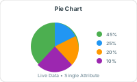
Pie Chart

Pie Chart Widget

Displays proportional distribution of attribute values over a configurable time window. Useful for seeing how much time a device spent in each state or the breakdown of categorical values.

Configuration:

Setting Description Default
Device Select source device Required
Attributes One or more attributes (multi-select with checkboxes) Required
Time Window (pieTime) Minutes of data to aggregate for the chart 50 minutes
Recent Data Points Number of data samples to include 10

Behavior:

Each selected attribute becomes a slice of the pie

Slice size proportional to cumulative value over time window

Supports INTEGER and DECIMAL data types

Hover shows exact values and percentages

Use Cases: Power consumption distribution, state time analysis, multi-sensor comparison.

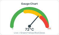
Gauge Chart

Gauge Chart Widget

Displays a single attribute value as a needle on a semi-circular gauge with configurable color zones. The needle moves in real-time as new values arrive, giving instant visual feedback on whether a value is in safe, warning, or critical range.

Configuration:

Setting Description Default
Device Select source device Required
Attribute Single numeric attribute Required
Min Value Gauge minimum (left end) 0
Max Value Gauge maximum (right end) 100
Zones Array of color zones with upToValue thresholds 2 zones

Zones Configuration:

Each zone has: Name, Color (hex), Up To Value (threshold)

Zones are sequential — Zone 1 covers minValue to zone1.upToValue, Zone 2 covers zone1.upToValue to zone2.upToValue, etc.

Example: Zone “Critical” (red) up to 50, Zone “Normal” (green) up to 100

Supports 2-5 color zones

Use Cases: Temperature monitoring, battery level, pressure indicators, tank fill levels, speed dials.

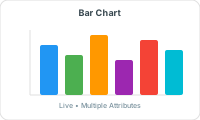
Bar Chart

Bar Chart Widget

Displays recent data points as vertical bars. Each bar represents one telemetry reading, plotted chronologically. The bars fill from left to right as new data arrives.

Configuration:

Setting Description Default
Device Select source device Required
Attribute Primary attribute for bar height Required
Bar Count Number of bars (data points) to display 5
Bar Color Fill color for bars (hex) #00cc00
Show Count Display value labels on bars true
Recent Data Points Historical data points to load initially 10

Use Cases: Production counts, hourly consumption, batch comparisons, event frequency.

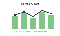
Combo Chart

Combo Chart Widget

Combines a line chart and bar chart on the same visualization, enabling comparison of two attributes with different scales or types. One attribute renders as a line (overlay), another as bars (base).

Configuration:

Setting Description Default
Device Select source device Required
Line Attribute Attribute rendered as line overlay Required
Line Color Line color (hex) #417505
Bar Attribute Attribute rendered as bars Required
Bar Color Bar fill color (hex) #f8e71c
Bar Count Number of bars to display 5
Recent Data Points Historical points to load 10

Use Cases: Temperature (line) vs humidity (bar), production rate vs defect count, speed vs fuel consumption.

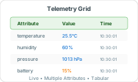
Telemetry Grid

Telemetry Grid Widget

Displays live device telemetry in a scrollable data table. Multiple attributes shown as columns with timestamps.

Configuration:

Setting Description Default
Device Select source device Required
Attributes Multi-select attributes (shown as columns) Required
Show Header Display column headers true
Show Date Display timestamp column true

Behavior: New rows appear at top as data arrives. Scrollable. Supports all data types.

Use Cases: Raw data inspection, multi-sensor monitoring, data validation, audit logging.

Device Latest Value

Shows the most recent value for multiple attributes in a clean card/box layout. Values update in real-time when new telemetry arrives.

Configuration:

Setting Description Default
Device Select source device Required
Attributes Select attributes to display latest values Required
Box Types Layout style (1=card view) 1

Behavior: Each attribute displayed as a separate card with name and latest value. Updates instantly on new telemetry.

Use Cases: At-a-glance current state, sensor dashboard header, quick device health check.

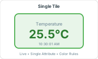
Live Value Tile

Single Tile Widget

Displays a single attribute value prominently as a large number with the attribute name. Compact widget ideal for key metrics that need instant visibility.

Configuration:

Setting Description Default
Device Select source device Required
Attribute Single attribute to display Required
Background Tile background color (can use vibrant colors for emphasis) #B8E986

Use Cases: Critical single metric (temperature, count, speed), status indicator, headline KPI.

Transformation Widget

The Transformation widget evaluates a device attribute value against one or more conditional rules and displays a custom output (text, image, URL image, or background color change) when conditions are met. It supports multiple transformation rules evaluated in priority order — the first matching rule wins.

How it works:

Select a device and a single attribute to monitor

Define one or more transformation rules (evaluated top to bottom)

Each rule has: Condition + Threshold + Output Type + Output Value

When live telemetry arrives, rules are evaluated in order — first match is displayed

If no rule matches, the widget shows empty / default state

Configuration:

Setting Description
Device Select source device
Attribute Single attribute to evaluate (check the attribute to monitor)
Transformations Array of rules — add multiple rules with the + button

Available Conditions (per data type):

Data Type Available Operators
STRING, BIT, BOOLEAN = (eq), != (ne)
INTEGER, DECIMAL, LONG, NUMBER > (gt), < (lt), = (eq), >= (ge), <= (le), <> (between)
DATE, DATETIME, TIME > (gt), < (lt), = (eq), >= (ge), <= (le), <> (between)

Output Types:

Type typeValue Behavior
Text Any string Displays the text string inside the widget when condition matches. Supports emojis and special characters.
Image Uploaded file name Displays an uploaded image inside the widget. Image scales to fit (center, stretch, or tile positioning).
Color Hex color code (e.g., #d0021b) Changes the widget background color to the specified color. The widget itself shows no text — just the color.

Image Position Options (for Image type):

Center: Image fits within widget bounds, maintaining aspect ratio, centered

Stretch: Image covers the entire widget area (may crop)

Tile: Image repeats as tiles to fill the widget

Between Condition: When using the <> (between) operator, TWO threshold values are required: conditionValue (lower bound) and conditionValue1 (upper bound). The condition is true when the attribute value falls within [lower, upper] inclusive.

Multiple Rules Example:

Rule 1: Temperature > 80 → Text: “🔥 CRITICAL” (evaluated first)

Rule 2: Temperature > 50 → Color: #f5a623 (orange background)

Rule 3: Temperature <= 50 → Text: “✓ Normal”

Rules are evaluated top to bottom. If Temperature = 85, Rule 1 matches first → displays “🔥 CRITICAL”. If Temperature = 60, Rule 1 fails, Rule 2 matches → widget background turns orange.

Use Cases:

Status Indicators: Show OK / WARNING / FAULT based on thresholds

Visual Alerts: Change widget color to red when values exceed limits

State Machines: Display “RUNNING”/”STOPPED”/”ERROR” based on device state attribute

Image Indicators: Show green checkmark image for normal, red X for fault

Range Monitoring: Use between condition to highlight when values are in specific operating bands

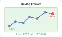
Device Tracker (Live Map)

Device Tracker Widget

Interactive map showing real-time device movement with route history. The map plots GPS coordinates from LATLONG attributes and draws a path showing the device’s movement over time.

Configuration:

Setting Description Default
Template Select device template Required
Latitude Attribute LATLONG type attribute for position Required
Longitude Attribute Same LATLONG attribute (contains both lat / long) Required
Device Select specific device(s) to track Required
Pin Color Color for historical route points #d0021b
Latest Pin Color Color for current / latest position #417505
Recent Data Points Number of route points to show 10

Behavior:

Map auto-centers on the latest device position

Historical points shown in pinColor, latest in latestPinColor

Route line connects consecutive positions

Click pins to view timestamp and coordinates

Use Cases: Fleet tracking, delivery monitoring, asset movement, geofencing visualization.

Video Stream

Embeds a live WebRTC video stream from a device directly into the dashboard. The device must have video streaming capability enabled in its template.

Configuration:

Setting Description
Device Select the device with video streaming enabled
Video Stream Resource Stream resource identifier (from device capabilities)
Template Device template GUID (auto-populated)

Use Cases: Security cameras, visual inspection, remote site monitoring, quality control.

Control Switch

Interactive ON / OFF toggle switch that sends device commands when clicked. Each state (left / right) maps to a different command with configurable parameters.

Configuration:

Setting Description Example
Device Target device for commands Required
Template Device template (for command list) Required
Control Type Widget style switch
Left Text Label for OFF state “OFF”
Left Command Command to execute when toggled left “turn_off”
Left Param Parameter value for left command “0”
Left Switch Color Toggle color in left state #d0021b (red)
Right Text Label for ON state “ON”
Right Command Command to execute when toggled right “turn_on”
Right Param Parameter value for right command “1”
Right Switch Color Toggle color in right state #417505 (green)
Show Status Display current device state true

Use Cases: Light on / off, motor start / stop, valve open / close, mode switching, relay control.

Device Shadow

Displays the device twin / shadow properties showing desired and reported values side by side. Allows viewing and updating shadow properties directly from the dashboard.

Configuration:

Setting Description
Device Select device to show shadow for
Template Template GUID (determines which shadow properties are shown)

Behavior: Shows all settings / twin properties defined in the template with their current desired and reported values. Updates when the device reports new shadow state.

Use Cases: Configuration monitoring, desired vs actual state comparison, remote settings management.

ⓘ NOTE

All live widgets update in real-time via SignalR connection. The device must be connected and sending telemetry for widgets to display data. For the JSON structure of each widget type, see the JSON Specification page.